Blog Categories
- Custom Web Development Solutions
- E-Commerce Website Design and Development
- Future of Website Design and Development
- Mobile-First and Responsive Design
- Outsourcing Benefits and Challenges
- SEO and Website Performance Optimization
- Technologies for Website Development
- Web Design for Startups
- Web Design Trends
- Website Development Best Practices
Tags
Services we Offer


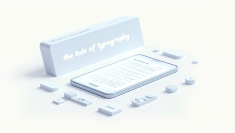
The Role of Typography in Mobile-First and Responsive Design
May 15, 2025
In today’s world, more than half of all web traffic comes from mobile devices. Designing for the smallest screen first ensures that content is legible, navigable, and engaging on smartphones, then scales gracefully to tablets and desktops. While layout, navigation, and asset optimization often steal the spotlight, typography remains the unsung hero of mobile-first and responsive design.
At OOPS INFOTECH—a premier website design and development outsourcing agency in India—we’ve witnessed firsthand how thoughtfully crafted typography can make or break the user experience. From selecting the right font families to implementing fluid type scales that adapt to any viewport, the role of typography is pivotal in guiding users’ eyes, reinforcing brand identity, and ensuring accessibility across all devices.
In this comprehensive guide, we’ll explore:
-
Why typography matters more than ever in mobile-first projects
-
Core principles of responsive typography
-
Techniques for fluid, scalable type systems
-
Performance considerations for web fonts
-
Accessibility best practices
-
Real-world examples and tips from OOPS INFOTECH’s design team
Let’s dive in.
1. Why Typography Matters in Mobile-First Design
1.1. First Impressions & Readability
On a small screen, every pixel counts. A headline that looks bold and clear on desktop can feel cramped on mobile, leading to missed calls to action or frustrated readers. Optimized typography ensures:
-
Legibility at small sizes
-
Hierarchy that guides the reader
-
Comfort for extended reading
Studies show that poor typography increases bounce rates by up to 60%. Conversely, well-scaled text can boost engagement and conversions—critical metrics in today’s competitive digital landscape.
1.2. Brand Voice & Consistency
Fonts convey personality. A playful sans-serif suggests modernity and friendliness, while a refined serif evokes tradition and trust. Maintaining consistent typography across device breakpoints helps reinforce your brand’s voice. At OOPS INFOTECH, our graphic design services ensure that brand typefaces remain consistent—from a 320px mobile layout to a full-width desktop hero section.
1.3. Accessibility & Inclusivity
Readability isn’t just about style; it’s about accessibility. Over 2 billion people worldwide live with some form of visual impairment. Proper font sizes, line heights, and contrast ratios make content accessible to everyone. We integrate accessibility audits into our website redesign company workflows to ensure compliance with WCAG guidelines.
2. Core Principles of Responsive Typography
2.1. Mobile-First Scaling
Start by defining base font sizes for the smallest breakpoint (e.g., html { font-size: 16px; } for 320px screens), then adjust upwards for larger viewports. This approach ensures that text never appears too small on compact devices.
2.2. Modular Scale & Hierarchy
A modular scale provides a mathematical ratio for font sizes—ensuring consistent visual rhythm across headings, subheadings, and body text. Popular ratios include the perfect fourth (1.333), the golden ratio (1.618), and minor third (1.2). For example:
:root {
 --type-base: 1rem; /* 16px */
 --scale-ratio: 1.333; /* perfect fourth */
 --type-h1: calc(var(--type-base) * var(--scale-ratio) * var(--scale-ratio) * var(--scale-ratio));
 --type-h2: calc(var(--type-base) * var(--scale-ratio) * var(--scale-ratio));
 --type-h3: calc(var(--type-base) * var(--scale-ratio));
 }
Using CSS custom properties and a modular scale, our custom web app development team builds consistent, easy-to-maintain type systems.
2.3. Fluid Typography with Viewport Units
Rather than jumping between discrete font sizes at breakpoints, fluid typography uses viewport units (vw, vh) to create seamless scaling:
h1 {
 font-size: calc(1.2rem + 2vw);
 }
This formula means the heading grows fluidly as the viewport widens, eliminating abrupt jumps. Our React.js development experts frequently leverage this technique in SPAs to maintain legibility across devices.
3. Techniques for Scalable Type Systems
3.1. Clamp() for Perfect Responsiveness
CSS clamp() offers a concise way to define minimum, preferred, and maximum font sizes:
p {
 font-size: clamp(1rem, 1rem + 1vw, 1.25rem);
 }
This ensures your paragraph text never falls below 16px or exceeds 20px, while still adapting to viewport changes. We’ve integrated clamp() into many of our Vue.js development projects for robust, future-proof typography.
3.2. Variable Fonts for Performance & Flexibility
Variable fonts combine multiple font weights and styles into a single file, drastically reducing HTTP requests. For example, a single .woff2 variable font can replace ten separate font files, improving load times—especially on mobile networks. Our cloud computing services team sets up automated build pipelines to serve only the required font subsets to each user.
3.3. Line Height, Letter Spacing & Readability
Good typography isn’t just about size—it’s about spacing:
-
Line height (
line-height: 1.5) increases readability. -
Letter spacing (
letter-spacing: 0.02em) can improve clarity at small sizes. -
Paragraph spacing (
margin-bottom) prevents blocks of text from feeling cramped.
Our website development process always includes thorough typography reviews, ensuring optimal spacing for text-heavy pages like blogs or documentation.
4. Performance Considerations for Web Fonts
4.1. Preload & Fallback Strategies
Web font files can block text rendering, leading to the dreaded “invisible text” flash. To mitigate this:
-
Preload key fonts in
<head> -
Provide system font fallbacks (
font-family: 'CustomVariableFont', system-ui, sans-serif;) -
Use
font-display: swap;so text appears immediately before the custom font loads
Our WordPress theme development team configures these optimizations by default, ensuring both design fidelity and performance.
4.2. Subsetting & Compression
Only include the glyphs you need. For multilingual sites, serve separate subsets per language. Combine subsetting with gzip or Brotli compression—reducing file sizes by up to 80%. We automate font subsetting in our build pipelines, reducing TTF/WOFF2 payloads without sacrificing character support.
5. Accessibility & Inclusivity in Typography
5.1. Contrast & Color
Ensure a contrast ratio of at least 4.5:1 between text and background. Tools like Lighthouse and Axe can audit your color choices. Our website redesign company offerings include an accessibility audit that flags insufficient contrast—guiding designers toward more readable palettes.
5.2. Responsive Text for Screen Readers
Semantic HTML remains critical. Use proper heading hierarchies (<h1> through <h6>), <p>, and <blockquote> elements. For ARIA contexts (e.g., alert dialogs), our CRM integration services team ensures dynamic content updates are announced correctly to assistive technologies.
5.3. Adjustable Text Controls
Offer users a way to increase or decrease font size without breaking layouts. This can be as simple as adding buttons that toggle classes on <html>, adjusting font-size globally. Such features demonstrate a commitment to inclusive design and are part of our non-profit website design best practices.
6. Real-World Examples & Best Practices
6.1. Case Study: E-Learning Platform
For a client in the education sector, we built an XR-enhanced classroom interface. Typography had to scale from 14px on mobile to 22px in headset displays. We:
-
Defined a modular scale (1.25 ratio)
-
Used
clamp()for all text elements -
Deployed a variable font with Latin and Devanagari subsets
The result: consistent legibility across phones, tablets, and AR headsets. Read more about our education website design work.
6.2. Case Study: eCommerce Site Redesign
An online retailer saw a 20% drop in mobile bounce rates after we:
-
Standardized font sizes with CSS custom properties
-
Preloaded Lato and Roboto variable fonts
-
Increased line-height from 1.3 to 1.5
Our ecommerce website development and SEO services teams collaborated closely—optimizing both visual and search performance.
7. Integrating Typography into Your Workflow
7.1. Design Systems & Style Guides
Document font families, weights, sizes, and spacing in a living style guide. Tools like Storybook or Figma libraries help front-end and design teams stay aligned. OOPS INFOTECH’s logo design services often include a mini style guide outlining typographic rules.
7.2. Automating with Build Tools
Leverage PostCSS plugins (e.g., postcss-clamp, postcss-fluid-type) to auto-generate fluid typography. Integrate font subsetting and compression in your webpack or Gulp pipeline. Our custom API development group frequently integrates these optimizations into CI/CD setups for maintainable, high-performance codebases.
7.3. Testing Across Devices
Use BrowserStack or physical device labs to test text rendering on iOS, Android, and various screen densities. Pay special attention to older devices, where font rendering can differ. Our mobile app development and Flutter app development teams run exhaustive typography tests as part of their QA workflows.
8. Future Trends in Web Typography
-
Variable Color Fonts: Fonts that embed multiple colors and gradients for dynamic, brand-aligned text treatments.
-
AI-Generated Typefaces: Custom fonts generated by AI to match brand tone with pixel-perfect precision. OOPS INFOTECH’s AI consulting team is exploring these for advanced branding projects.
-
Responsive Ligatures & Glyph Variations: Contextual alternates that adapt letterforms based on viewport or surrounding text—enhancing legibility and aesthetics.
Conclusion
Typography is far more than an aesthetic flourish—it’s the backbone of mobile-first and responsive design. By mastering fluid scales, performance-optimized web fonts, and inclusive practices, you ensure that your content shines on any device.
At OOPS INFOTECH, we combine strategic typography with our full spectrum of website design and development services to create digital experiences that are beautiful, accessible, and high-performing. Whether you’re launching a new mobile-first site, refreshing an existing project, or building an immersive web app, our team is here to help.
Ready to elevate your typography and user experience? Explore our services or get in touch for a custom consultation.
Related Posts
Affordable Web Design Solutions for Bootstrapped Startups
In today’s competitive startup landscape, having a compelling online presence is non-negotiable. But for bootstrapped founders, balancing quality with budget constraints can feel like walking a tightrope. This article explores practical, budget-friendly web design solutions—ranging from modular templates to lean development practices—that empower early-stage startups to launch fast, iterate often, and grow sustainably. Learn how partnering with a specialized agency like OOPS INFOTECH can unlock pro-grade designs and strategic digital support, even on a shoestring budget.
Designing for Accessibility: Trends That Improve Usability for All
In today’s digital landscape, accessible design isn’t just best practice—it’s essential. Discover the latest trends in web design and development that empower all users, from responsive, mobile-first layouts to AI-driven personalization, and learn how OOPS INFOTECH delivers inclusive solutions tailored to your needs.
Best Practices for Incorporating Media Queries in Mobile-First Development
Responsive design is critical in today’s mobile-first world, and media queries are the backbone of that adaptability. In this comprehensive guide, learn how to optimize your site with smart media query practices, ensuring a superior user experience across various devices. Discover how partnering with OOPS INFOTECH can elevate your custom web development projects for lasting success.
Responsive Design in Custom Web Development: Why It Matters
Responsive design is the cornerstone of modern custom web development. In this comprehensive guide, explore its critical role in providing seamless user experiences across all devices, improving SEO, and boosting digital performance. Learn how partnering with OOPS INFOTECH can help you implement cutting-edge responsive design strategies for sustainable growth.
How to Design a Scalable Website for Growing Startups
Scalability is crucial for startups poised for growth. In this comprehensive guide, explore how to design a scalable website that adapts to increasing traffic and evolving business needs. Learn about key strategies, modern technologies, and best practices, and discover how partnering with OOPS INFOTECH can help you build a robust, high-performance digital platform.
The Growing Popularity of Tailwind CSS for Responsive Web Design
Tailwind CSS is rapidly gaining traction among web developers for its utility-first approach and flexibility in creating responsive designs. Discover why this innovative framework is transforming the way websites are built and how partnering with experts like OOPS INFOTECH can elevate your digital presence.
Creating a Consistent Brand Experience Across Devices
Explore best practices for delivering a consistent brand experience across devices. Learn how mobile-first and responsive design strategies enhance brand identity and user experience, with insights from OOPS INFOTECH.
Latest from our Blog

For resource-constrained startups, juggling every operational detail can derail growth. This article explores five ways…

Downtime can erode user trust and revenue in an instant. This comprehensive guide from OOPS…

In today’s competitive startup landscape, having a compelling online presence is non-negotiable. But for bootstrapped…

From high-speed APIs to full-featured e-commerce sites, Python powers every tier of modern web development.…

Leave a Reply