Blog Categories
- Custom Web Development Solutions
- E-Commerce Website Design and Development
- Future of Website Design and Development
- Mobile-First and Responsive Design
- Outsourcing Benefits and Challenges
- SEO and Website Performance Optimization
- Technologies for Website Development
- Web Design for Startups
- Web Design Trends
- Website Development Best Practices
Tags
Services we Offer


Creating a Consistent Brand Experience Across Devices
March 7, 2025
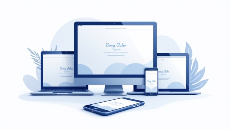
In today’s multi-device world, your brand’s digital presence must be consistent across smartphones, tablets, laptops, and desktops. A cohesive brand experience builds trust, reinforces identity, and ensures that your message resonates with your audience, regardless of the device they use. In this blog post, we’ll explore the key strategies and best practices for creating a consistent brand experience across devices. We’ll also discuss how mobile-first and responsive design principles play a crucial role in achieving this goal, and highlight how OOPS INFOTECH—a leading website design and development outsourcing agency in India—can help bring your vision to life.
Why Consistency Matters in Branding
A consistent brand experience is vital for creating a memorable and trustworthy online presence. When customers encounter the same color schemes, typography, and messaging across every touchpoint, it reinforces your brand identity and builds familiarity. This consistency helps establish credibility and encourages customer loyalty.
Consider how a cohesive digital strategy can enhance your overall marketing efforts. Whether you’re implementing digital marketing services or launching a new content marketing campaign, a uniform brand experience ensures that your audience recognizes your brand instantly, no matter where they interact with it.
The Challenges of Multi-Device Branding
While the benefits of consistency are clear, achieving a uniform brand experience across different devices comes with its own set of challenges:
- Diverse Screen Sizes: The wide range of devices—from small smartphones to large desktop monitors—means that your design must be flexible enough to look great everywhere.
- Varied User Contexts: Users interact with websites differently depending on the device. For example, mobile users may seek quick, easily digestible content, whereas desktop users might appreciate more detailed information.
- Technical Limitations: Differences in operating systems, browsers, and hardware can affect how your brand elements are rendered and experienced.
Addressing these challenges requires a well-planned strategy that incorporates mobile-first principles and responsive design techniques.
Embracing Mobile-First and Responsive Design
Mobile-first design is about designing for the smallest screen first and then scaling up to larger devices. This approach forces designers to focus on the essentials, ensuring that every element on the screen serves a purpose. Responsive design, on the other hand, ensures that your website adapts fluidly to various screen sizes and orientations.
Key Principles for Mobile-First Design
- Prioritize Essential Content:
With limited screen space, focus on what truly matters to your audience. Keep your messaging clear and your calls-to-action (CTAs) prominent. - Simplify Navigation:
A streamlined navigation menu is essential on mobile devices. Consider using a hamburger menu or other mobile-friendly navigation patterns to keep the interface clean and intuitive. - Optimize Load Times:
Speed is critical on mobile. Optimize images, streamline code, and leverage cloud computing services to ensure fast load times, regardless of device. - Maintain Consistent Visual Elements:
Use the same color schemes, fonts, and imagery across devices. Consistency in visual identity not only reinforces your brand but also builds trust with your audience.
Responsive Design Best Practices
Responsive design ensures that your website looks and functions seamlessly on any device. Here are some best practices:
- Fluid Grids:
Use percentage-based layouts to ensure that your design adapts to any screen size. This approach helps maintain proportionality and consistency. - Flexible Images:
Optimize images to scale within their containers, ensuring that visuals look sharp on high-resolution displays without slowing down the site. - Media Queries:
Leverage CSS media queries to apply different styling rules based on the device’s characteristics. This technique allows for fine-tuning of your design for specific screen sizes and orientations.
Implementing these principles is essential for delivering a consistent brand experience. Whether you’re working on responsive website design or enhancing a website redesign project, a mobile-first and responsive strategy can make all the difference.
Strategies for Creating a Consistent Brand Experience
1. Unified Visual Identity
A strong, unified visual identity is the cornerstone of any successful brand experience. This includes consistent use of your logo, color palette, typography, and imagery across all devices.
- Logo and Color Consistency:
Ensure that your logo appears correctly on all devices. Use high-resolution images and consider variations (such as a simplified version for mobile) to maintain clarity. Consistent color schemes help reinforce your brand’s personality and are critical for building recognition. - Typography:
Choose fonts that are legible across devices. Pay attention to font size, weight, and spacing to ensure that text is readable whether on a smartphone or desktop. - Imagery:
Use professional, high-quality images that align with your brand. Whether it’s through graphic design services or carefully curated photography, visuals play a key role in conveying your brand’s message.
2. Consistent Messaging and Tone
Your brand’s voice should be consistent across every channel. This means aligning your website content with your social media posts, email marketing, and other digital communications.
- Content Strategy:
Develop a content strategy that outlines your brand’s tone, style, and key messages. This consistency helps users connect with your brand on a deeper level. - Copywriting:
Ensure that your website copy reflects your brand’s personality. Whether you’re emphasizing innovation, reliability, or creativity, every piece of content should reinforce your brand identity.
3. Cross-Platform Functionality
A consistent brand experience goes beyond visuals and messaging. It extends to how users interact with your website across different devices.
- Seamless Navigation:
Navigation should be intuitive and consistent. Users switching from a desktop to a mobile device should find the layout familiar, even if the navigation adapts to the screen size. - Consistent Interactions:
Buttons, links, and other interactive elements should behave similarly across devices. This consistency reduces user friction and improves the overall experience. - Testing Across Devices:
Regularly test your website on multiple devices and browsers to ensure that all elements work as intended. Tools like responsive design testing frameworks can help streamline this process.
4. Leveraging Technology and Innovation
Integrating the right technologies can enhance your ability to deliver a consistent brand experience. Here are a few key areas to consider:
- Content Management Systems (CMS):
Utilize a robust CMS that supports responsive design. Platforms like WordPress, combined with WordPress development services, can offer flexible solutions that adapt to various devices. - Custom Web App Development:
For businesses with unique requirements, custom web app development can create tailored experiences that align perfectly with your brand. Leveraging custom web app development services ensures that every aspect of your site is optimized for performance and consistency. - Analytics and User Feedback:
Use analytics tools to track how users interact with your website across different devices. This data can inform future design decisions and help you continually refine the user experience.
The Role of OOPS INFOTECH in Delivering Brand Consistency
OOPS INFOTECH is a renowned website design and development outsourcing agency in India that specializes in creating seamless, consistent digital experiences. With expertise spanning website design, website development, and digital marketing, OOPS INFOTECH is well-equipped to help businesses build a unified brand presence across devices.
Customized Solutions for Every Business
At OOPS INFOTECH, every project begins with a deep dive into your brand’s identity and goals. Whether you’re launching a new website or redesigning an existing one, they create tailored solutions that ensure consistency across all touchpoints. Their approach includes:
- Comprehensive Design Systems:
Developing robust design systems that include style guides, component libraries, and standardized templates to ensure consistency. - Mobile-First Strategies:
Prioritizing mobile-first design to create intuitive experiences that seamlessly transition to larger devices. This is crucial for meeting today’s multi-device demands. - Ongoing Optimization:
Utilizing agile development methodologies and continuous testing to ensure that your website not only launches successfully but continues to perform optimally over time.
Integration of Cutting-Edge Technologies
OOPS INFOTECH also leverages the latest technologies to enhance the brand experience. From integrating cloud computing services for scalable performance to employing advanced custom API development for seamless data integration, they ensure that every aspect of your website supports a consistent and engaging brand narrative.
Real-World Examples and Industry Trends
Many forward-thinking businesses have already seen the benefits of a consistent brand experience. Consider the following examples:
- E-commerce Platforms:
Online retailers that maintain a uniform look and feel across devices often enjoy higher customer retention and conversion rates. By utilizing ecommerce website development, companies can provide a seamless shopping experience whether customers are browsing on a mobile phone or desktop. - Corporate Websites:
For large enterprises, brand consistency is crucial for maintaining professionalism and trust. A cohesive digital presence, supported by responsive design and robust development practices, reinforces the company’s identity and values. - Digital Marketing Initiatives:
Consistent branding across websites and digital campaigns enhances the effectiveness of CRM integration services and targeted marketing strategies, ensuring that every interaction reinforces the brand’s message.
These trends highlight the importance of investing in design and development practices that prioritize consistency and user experience across all platforms.
Future Trends in Brand Consistency
As technology evolves, so do the expectations of digital consumers. Here are some emerging trends that will further shape how businesses deliver a consistent brand experience:
- Artificial Intelligence and Personalization:
AI-driven personalization will allow websites to adapt content dynamically based on user behavior and preferences, further enhancing consistency through tailored experiences. - Augmented and Virtual Reality:
As AR and VR become more integrated into digital experiences, maintaining a consistent brand identity across these immersive platforms will be essential. - Voice-Activated Interfaces:
With the rise of smart speakers and voice assistants, ensuring that your brand’s tone and messaging remain consistent in voice interactions is becoming increasingly important.
Staying ahead of these trends requires a forward-thinking approach and a commitment to continuous innovation—qualities that are central to the ethos of OOPS INFOTECH.
Conclusion
Creating a consistent brand experience across devices is a critical component of modern web design. In today’s fast-paced, multi-device landscape, ensuring that your brand’s visual identity, messaging, and user experience remain uniform is not just a design challenge—it’s a strategic imperative.
By embracing mobile-first design and responsive design principles, businesses can deliver a seamless digital experience that builds trust, enhances engagement, and ultimately drives conversion. Whether you’re focused on refining your visual identity through graphic design services or optimizing your website’s functionality with robust website development, the goal remains the same: a unified brand experience that resonates with your audience, regardless of the device they use.
Partnering with experts like OOPS INFOTECH can accelerate this transformation. With their deep expertise in digital marketing, website design, and development, OOPS INFOTECH provides the tools, strategies, and support needed to create a cohesive digital presence that stands out in a crowded market.
Invest in a consistent brand experience today, and set the foundation for long-term customer loyalty and success. By aligning your design and development efforts with the latest best practices and emerging trends, you ensure that your brand remains relevant, engaging, and competitive across every digital touchpoint.
Embrace the future of mobile-first and responsive design with a commitment to consistency, and watch as your brand transforms into a powerful, recognizable force in the digital realm.
Related Posts
The Benefits of Headless E-Commerce for Online Retailers
Discover how headless e-commerce empowers online retailers with faster performance, better user experiences, and seamless third-party integrations. Learn why brands are moving beyond traditional platforms with insights from OOPS INFOTECH.
Designing for Accessibility: Trends That Improve Usability for All
In today’s digital landscape, accessible design isn’t just best practice—it’s essential. Discover the latest trends in web design and development that empower all users, from responsive, mobile-first layouts to AI-driven personalization, and learn how OOPS INFOTECH delivers inclusive solutions tailored to your needs.
How to Use Flexible Grid Layouts for Better Responsive Designs
Flexible grid layouts are the foundation of modern responsive design. Discover mobile-first strategies, CSS Grid techniques, and best practices with insights from OOPS INFOTECH.
How to Build Trust with an Effective Startup Website Design
A strong, trustworthy website design is crucial for startup success. Learn how to craft a powerful first impression and build lasting trust with your audience, featuring insights from OOPS INFOTECH, a leading website design and development agency in India.
Why Storytelling Matters in Startup Website Design
Storytelling is a powerful tool in website design, especially for startups looking to stand out. This comprehensive guide explains why storytelling is essential in creating dynamic, memorable websites that connect with audiences, build trust, and drive conversions. Gain expert insights from OOPS INFOTECH and discover best practices to incorporate storytelling into your custom web design strategy.
Illustrations vs. Photography: What’s Trending in 2025?
As visual content continues to shape web experiences, the debate between illustrations and photography remains at the forefront of design trends. In this comprehensive guide, discover what’s trending in 2025, explore the benefits and challenges of each style, and learn how to choose the right approach for your website. With expert insights from OOPS INFOTECH, transform your digital presence with the perfect visual strategy.
How to Design a Scalable Website for Growing Startups
Scalability is crucial for startups poised for growth. In this comprehensive guide, explore how to design a scalable website that adapts to increasing traffic and evolving business needs. Learn about key strategies, modern technologies, and best practices, and discover how partnering with OOPS INFOTECH can help you build a robust, high-performance digital platform.
The Evolution of Hero Images: What Works Best Today?
Hero images have come a long way from simple banners to dynamic, interactive experiences. In this blog, we explore the evolution of hero images, the trends shaping modern web design, and how startups can leverage innovative visuals to boost engagement and conversions. Find out how partnering with OOPS INFOTECH can help transform your website’s visual strategy.
The Impact of Call-to-Action Placement on Startup Websites
Effective call-to-action (CTA) placement is crucial for converting visitors into customers on startup websites. This comprehensive guide explores the impact of CTAs on user behavior, offers actionable strategies for optimal placement, and highlights how partnering with OOPS INFOTECH can help startups maximize their online potential.
How Progressive Web Apps Align with Mobile-First Strategies
Progressive Web Apps (PWAs) are revolutionizing web development by combining the best of web and mobile app experiences. Discover how PWAs align with mobile-first strategies to deliver fast, engaging, and accessible digital experiences, and learn how OOPS INFOTECH leverages this technology to drive business success.
Latest from our Blog

For resource-constrained startups, juggling every operational detail can derail growth. This article explores five ways…

Downtime can erode user trust and revenue in an instant. This comprehensive guide from OOPS…

In today’s competitive startup landscape, having a compelling online presence is non-negotiable. But for bootstrapped…

From high-speed APIs to full-featured e-commerce sites, Python powers every tier of modern web development.…

Leave a Reply